


Designing custom single-game ticketing page for the Sacramento Kings that brings structure, clarity, and filtering to a high-volume experience across row and calendar views.
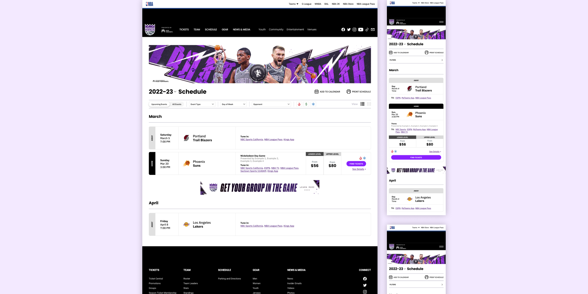
The Sacramento Kings came to us looking for a custom single-game ticketing page that could stand alongside the best in the NBA. As the sole designer on the project, I was responsible for translating a complex set of client requirements into a clean, intuitive experience that worked across both row and calendar views, desktop and mobile, and a wide range of game types and promotional scenarios.
Designing a high-volume ticketing page meant making a large amount of information feel manageable, without sacrificing the details fans actually need to make a decision.

I designed a filterable, two-view ticketing experience from the ground up, using progressive disclosure and responsive design principles to give fans the right information at every step of the flow.
My process began with mapping out the full scope of content the page needed to support, from filtering by hot games, promotions, and opponent, to displaying ticket price ranges, sponsor logos, and event-specific banners. With no user research in scope, design decisions were grounded in best practices and validated through close collaboration with the client across multiple rounds of iteration.
The page was built around two views: a row view for quick scanning and a calendar view for fans who think in terms of dates. Each required its own approach to information density. In the calendar view, I consolidated prices to the lower range and reserved further details for the modal, reducing cognitive overload in a tight tile space. The modal itself was redesigned with a dedicated Game Details section, giving users a clear place to land when skimming for specifics.
Throughout iteration, I maintained a design defense to document the rationale behind key decisions, which became a valuable tool for stakeholder alignment when client requests pushed against best practice. When the client asked for alignment and sizing changes that would have introduced visual inconsistency or hurt readability, I was able to use documented reasoning to guide the conversation toward solutions that worked for both sides.

“Our biggest ask is the ability to toggle between a list and calendar view for the single game tickets page. If we could have areas to showcase locations, sponsors, possible tags, and ticket information that would be great too."

Client
The Kings approved the design quickly and moved to implementation, the completed page has been live. The engagement's success led directly to a follow-up request for the schedule page, which I designed using the same template and system. For my first large client at the agency, it was a strong signal that the work landed well.
Takeaways