


A two-year website engagement for Chilton Auto Body, modernizing page templates, navigation, SEO copy, and user flows to improve conversion and brand presence.
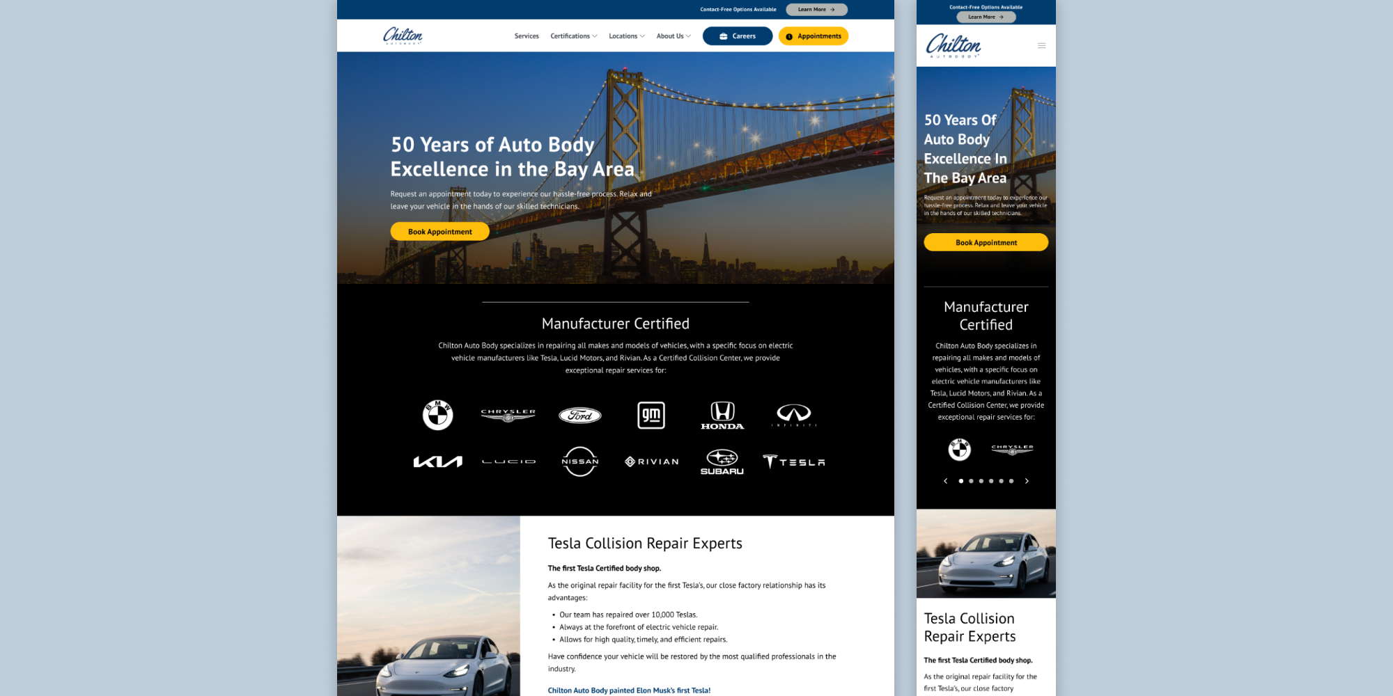
When I took over as lead UX designer on the Chilton Auto Body account, the site was visually outdated, lacked SEO structure, and underperformed as a conversion tool. Over two years, I worked alongside our agency's development team to touch every corner of the site. From page templates and navigation to user flows and EV-focused content, bringing the experience in line with industry standards and the quality of service Chilton delivers.
Improving a live website over a long engagement meant balancing strategic ambition with real constraints.
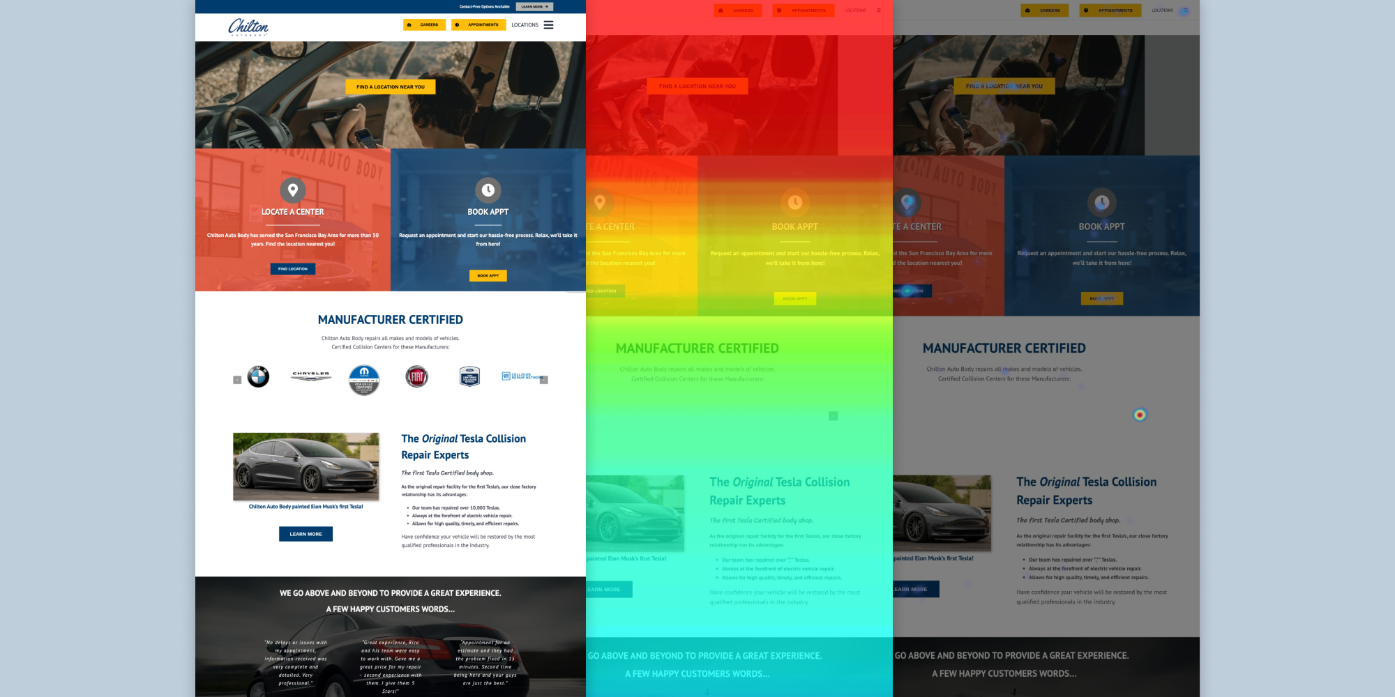
I audited, prioritized, and systematically improved the Chilton website over two years, proposing and implementing UX initiatives that modernized the experience and moved the needle on conversion.
Taking over an established client account meant first getting a clear picture of where the site stood. I created an UX initiative framework to evaluate improvements holistically and as a result, gave the team a structured way to prioritize work within our monthly hour constraints. This became the backbone of how we scoped and phased every project that followed.
One of the most impactful initiatives I proposed was merging the locations and appointment booking flows. HotJar data showed users navigating between the two interchangeably, pointing to an opportunity to consolidate them into a single, streamlined experience. I pushed for the merger based on competitor flow analysis and behavioral signals, designed the updated flow, and implemented it in collaboration with our development team. The result was a measurable improvement in CVR for that flow specifically.
Beyond the flow work, I reworked page templates, navigation, and the footer to bring visual consistency and usability up to industry standards. I also led the integration of SEO-driven copy across the site, including EV-focused content to support Chilton's positioning as a certified repair shop for Tesla, Lucid, and Rivian. Every initiative was sequenced deliberately, keeping the highest-impact work at the front of each phase.
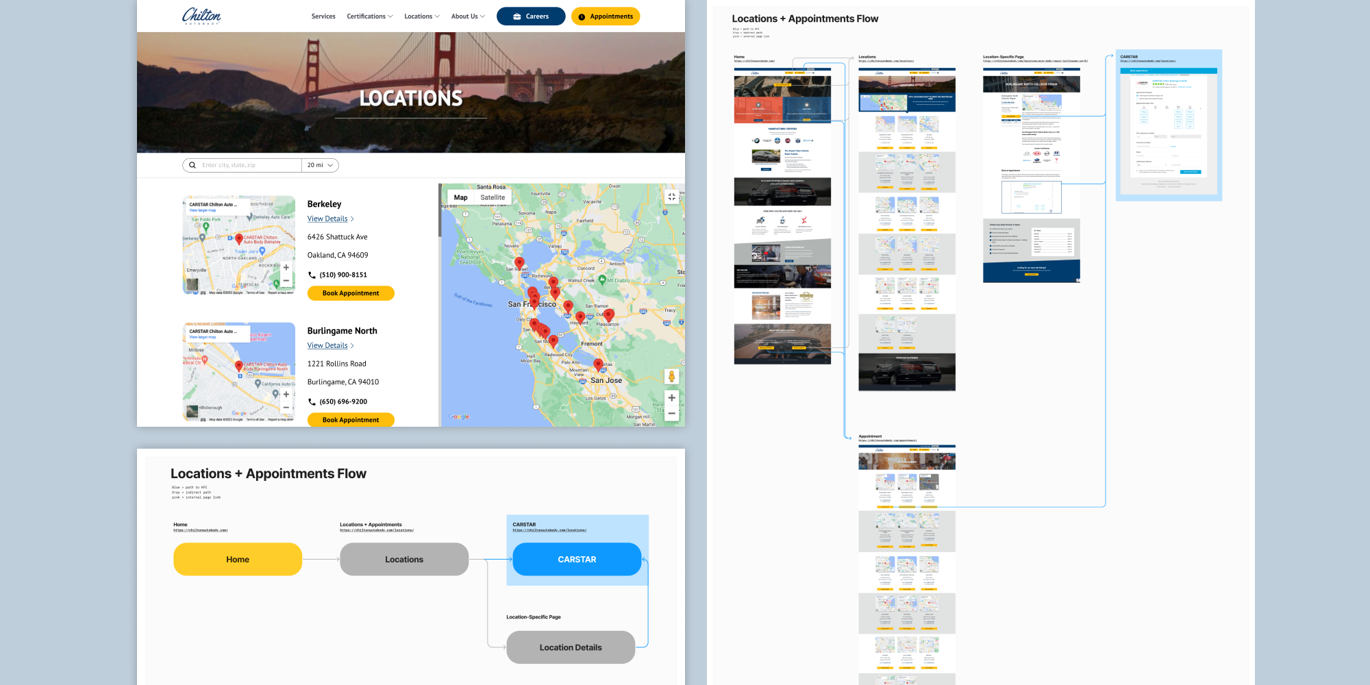

“Most users are looking at both locations and appointments. However, these two pages are hosted separately making it a maze as they’re going back and forth between pages."


Over two years, the Chilton website was fully modernized with every page touched by our team. The locations and booking flow merger drove positive CVR results and the site now reflects the quality and specialization, particularly around EV repair, that Chilton brings to its work. It was a strong engagement that demonstrated what consistent, strategically sequenced UX work can accomplish within real-world constraints.
Takeaways


